Back in the early days, Windows users had very few, if any, alternatives to Outlook Express, the e-mail client provided with Windows 98 and ME, if I remember correctly. So when Netscape came out with their all-in-one web-browser and e-mail suite, it was encouraging. Then in the 2000's, Mozilla released a standalone e-mail client named Thunderbird, which I have almost faithfully used up until the other day. I also starting using Firefox not long after its first stable release in the 2000's, and still (reluctantly) use it today.
On this blog, I really try to post only encouraging or non-negative articles, but this will be one of the exceptions.
A little while ago, the Thunderbird team released a blog post that let users know that a huge UI rebuild was coming down the line. I even commented on that post (looks like they didn't post or approve the comment, though) and asked that the changes be 'sane' and that any big changes could be disabled or minimized in settings. Unfortunately they ignored me just like all the other times I've given them feedback. The new Thunderbird, to me, is frustrating and visually unappealing.

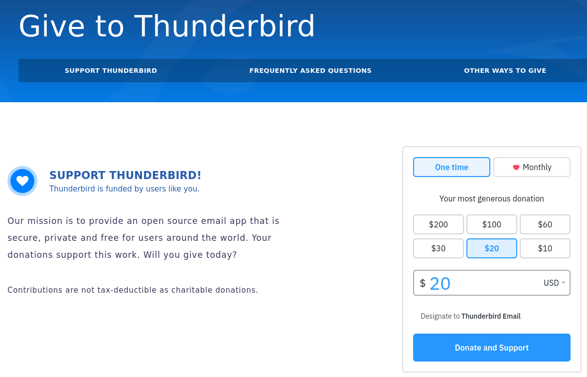
What gets me about Mozilla and their 'donate to us to keep the project alive' prompts is that they're asking people that they are actually working against for donations. I am not going to give from our family's hard-earned money to an organization that aligns themselves with non-conservative values and, at nearly every opportunity, messes up an already-working app.
I get that these software projects want to keep their apps 'relevant' and 'visually refreshed' so they don't look like something from GNOME 1.0 or Windows 95, but through the years many of the changes were frustrating instead of helpful.
For example, I remember when Mozilla forced the Firefox tabs from a very useful lower position to a position above the address bar. This was frustrating to me because tabs on the bottom were easier to get to while I struggle with accessibility issues. I even let them know it was more challenging from an accessibility standpoint and they just ignored me (and others). They then made some other UI changes that made it a little bit harder still to use. I became very frustrated with Mozilla after all of these changes and looked for a decent non-commercially developed, non-Chrome-based alternative, but there just really wasn't one (not one that worked well, anyway).
While nearly dying caused some foggy spots of memory for me, I know Thunderbird also had some unwelcome changes. I remember a recent update where the mostly consistent and non-distracting coloring of account and folder icons was eschewed for icons that are different vibrant colors. I left them feedback about this which had gained support by others who felt the same way, but we were ignored, as usual. Now with this 'Supernova' UI 'overhaul', the toolbar layout is ridiculous, icons are all over the place and you have to bounce all over the screen just to do something that was much easier in previous versions.
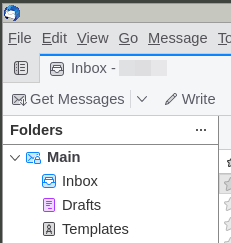
Old UI upper-left corner
Nothing here screams 'LOOK AT ME!!!'
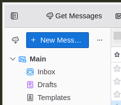
New UI upper-left corner
Sure, a big blue button won't be distracting!
Go ahead, squint at this page and tell me what stands out the
most...
Big honkin' blue button
With this new 'Supernova' update, you now have, by default, this very distracting and
visually jarring big blue 'New Message' button. I really don't know what was so wrong
with having a normal toolbar button that served the same purpose before. It's like
thousands of users cried out to the Thunderbird team and said "We don't know how to
compose a new message. Can you please help us??". So, yeah, you can hide this button
and also the 'Get Messages' button, but then you're left with a big gaping space that's
useless...
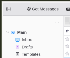
Wasted space when both buttons are hidden
Also the default density of the various elements is super packed together, which is unpleasant to look at. Yes, you can change this in the hamburger menu, but you first have to find it, and it's actually up near the window buttons (which, by the way, do not match my desktop theming on Linux at all)!

New UI upper-right corner
I guess you can call me old-fashioned or more mentally delayed than I already am, but these changes just don't seem to provide any real value or benefit -- it just looks different (and more clunky) than the old version. I also don't like the default 'client-side rendered' window buttons when using MATE on Linux. For some reason many software projects are just so in love with how the GNOME project does things that everything MUST conform to that standard, even on Windows, instead of respecting the user's preferences and choices. For people who haven't used these apps for a long time, it's probably no big deal, but those of us who used text-only programs running on MS DOS before all the fancy graphical stuff came out, yanking away a semi-friendly interface in favor of 'something new' just for the sake of change is frustrating and borders on rude.
A general trend
I really can't blame folks and projects for putting their best foot forward, but here's
the thing -- if you're going to change something, at least change it to
improve it instead of changing it in the name of 'shiny'. This seems to be a
growing trend. Just like companies that are chained to shareholder demands to keep
things 'fresh' and 'relevant' these software projects are stuck in the same brutal
cycle. 'Grow or die' is what a lot of them probably are driven by. That stinks for
people who actually are mostly pleased with the status quo. Small incremental changes
are fine, but when you want to revamp most of the UI without real benefit, you
discourage and frustrate your users.
Okay, okay, I just now re-scanned the Thunderbird team's blog post I linked to above, and I get *some* of the reasons they went with a complete overhaul. Constantly building on top of and bolting onto ancient and less-than-stellar code is definitely not a recipe for stability or user satisfaction, but they really could have made things more user-friendly in the process, and they really *should* have provided more control to the user in regards to the UI.
Mozilla displays inappropriate content to business and child users
I am the administrator for dozens of customer computers and often need to update or
reinstall software on a regular basis. The other night, for example, I changed over
some customer computers from Firefox 'release' channel to the 'ESR' channel. Part of
the reason I did this is nearly every time you update 'release' channel Firefox, it
shows some new tab advertising a Mozilla service, or shows some content that is
inappropriate in a business setting. Most business users just want to get on with
things and not deal with a "What's New" or "Try Firefox VPN!" tab every time you turn
around. Also the 'release' channel's non-removable extensions toolbar icon hasn't made
its way into the 'ESR' channel yet. If it was up to me, I'd remove Firefox from
all customer computers, but sometimes it is needed for certain websites that
don't work well on Chrome. I'm no fan of Chrome either -- I'll explain later.
If you happen to do a new install of Firefox, you cannot avoid seeing the 'Recommended by Pocket' articles that are displayed by default. Many of these articles are very left-leaning and anti-conservative, which goes against not only my beliefs but the beliefs of most of my customers. In Firefox settings it says this about these articles: "Exceptional content curated by Pocket, part of the Firefox family", so Mozilla most certainly approves of what is shown. If you constantly favor only one side of the coin, the other side will suffer fatigue and grow to despise you and eventually walk away from your brand. I have heard others also express this concern about Mozilla. Not a good strategy, Mozilla (see Target, Bud Lite, et al).

An example 'Recommended by Pocket' article
How is this appropriate in a business environment or around
children?
Searching for alternatives
In regards to Thunderbird, I have already found an acceptable alternative and doing
fine with it. As far as Firefox goes, I'm still stuck. Nearly every other Firefox
alternative out there is just a rebranded clone of Google Chrome, which I don't want to
use. Firefox wins out (slightly) over Chrome due to the ease of backing up its user
profiles. You can back up your Firefox profile and restore it without too much fuss,
while Chrome freaks out and forgets not only your passwords but some of your settings
when you attempt to restore it from a backup. When I find a reliable non-Chrome
browser alternative out there with ease-of-profile-backup, I won't be able to drop
Firefox fast enough.
ABSOLUTELY NOT
"Our mission is to provide an open source email app that is secure, private and free for users around the world. Your donations support this work. Will you give today?" - Mozilla Thunderbird team (emphasis mine)
The above quote contains 'for users around the world' which appears to mean they are developing apps for select users, not all, and definitely not folks like me. It would be silly to donate to an organization that consistently messes up apps I've come to depend on for decades, I will not give to an organization that is clearly anti-conservative and I will not give to an organization that ignores clear and reasonable feedback.
I have purposely not posted what e-mail client I am using now, but if you're interested, leave a comment below.
So ends another era. I recently stopped reading Ars Technica after many long years due to their caustic and anti-conservative content and I'm sure it will not be the last site, organization and software project I'll move away from. All of these are staffed by real people who, deep inside, are crying out for intimacy with their Creator, but instead settle for counterfeit intimacy through unbiblical relationships, harmful beliefs and unfavorable partnerships. I do hope that God places many believers across the paths of these folks and that a really joyous harvest results!
God bless you, and thank you for reading!
![]()
About me
First and foremost I'm a follower of Jesus Christ. After that, I'm a blessed husband,
father and grandfather. I do remote computer work for a living although it's mostly
part-time. I'm an amateur radio operator - AF7EC. When I'm not working on the endless
list of house and car projects, I like to tinker with electronics, like to listen to
shortwave radio and write software (mostly open-source) in C, C++, Python and Free
Pascal. I usually run Linux as my main operating system but sometimes I'm forced to
endure macOS and Windows 11 for gaming with my son or testing software. Overall, I am
a big nobody, but always willing to share about Jesus and all that God has done for me
and my family.
Comments
(No comments yet)